We came up with many different fonts to fit our trailer and our poster cover, having the correct font is important to set the right tone for the trailer, if there are lots of different fonts which don't match with the shots, it will bring down the overall tone of trailer and bring the trailer down.
|
this was the first font that we considered, however its not very suited towards a horror film, and would not make the title scene as effective as it could be,the font doesn't balance with the overall tone of the trailer. this font would be best suited to an a more artsy film as it looks likes its been painted on
|

|
|
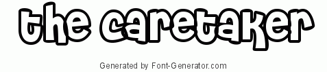
Although this is a very interesting font, it is not suited for a horror trailer and would not make for an effective title screen. Using this font would throw off the balance between the shots and the text, and bring down the quality of the overall trailer. A font like this would best be suited to a comedy or a children's programme. |
|
|
This font would look alot better in a sci-fi movie trailer rather than a horror, It looks like a computer font which would make more sense alongside shots of futuristic events. Therefore this would not be suitable for a horror film as it doesn't set the right tone
|

|
poster
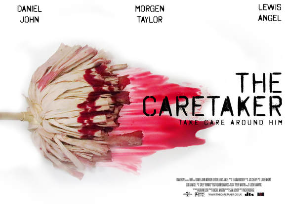
We decided to go for a simple font for our poster as well because we thought it would represent our trailer very well and we thought it would confuse the overall effect of the trailer if we used a very different font on the trailer and the poster. we decided to use a very large font throughout the poster the catch the eye of the audience, we also decided to keep the actors names fairly large aswell to keep with the theme of the poster. we also tried to keep a reasonable size in proportion with the poster.
trailer
For our trailer, we decided to use a simple font to make sure we didn't over complicate the text or have it really fashy so that it is easier for the audience to read as the trailer is playing we chose yto make the text very large to stand out from the background, we also made the text very bright so that it is a lot more bold around the dark background. we alsso stuck to the same font as oir poster as we didnt want to over complicate things and make it easy to follow. We have included our tagline on this screen also and sized it smaller than the title so it doesn't draw all of the attention away from the main focus.
magazine
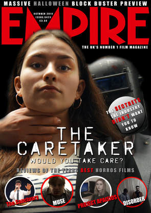
we made the fonts for the magazine clear as well as the main purpose of the magazine cover is to draw people in and get them to read it. We took inspiration from our poster when picking the extra fonts as we also used a lot of the same ones we did for our poster, and for the main title of the magazine, we made it look like your stereotypical magazine cover font as to not challenge your conventional magazine cover and make it still look appealing to the audience. we still wanted the magazine to look professional so we kept it to still have hints of a stereotypical magazine so we used inspiration from other empire magazines and used them as a template.
