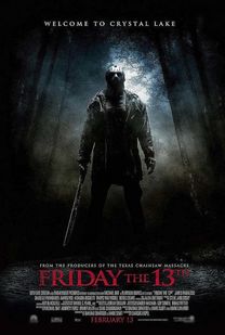
Friday the 13th
The poster for Friday the 13th is a really effective poster, it uses dark and plain blurred colours to create an eerie effect behind the killer to give him a more discreet identity as he is blended in to the forest. They have used a bold red title to stand out and catch the audience's eye and make it more prominent on the poster, also the colour red has connotations to fire and blood which are associated with death and suffering. The fact that this poster is looking up at the killer makes the audience feel intimidated and the fact that the characters is in the shade makes it feel more eerie as you can't quite see the figure.
|
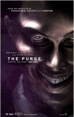
The Purge
In this horror movie poster we can see what a professional poster is meant to look like, so that when we come to create ours we can take ideas from all four of these posters and incorporate them into our on to make it look as professional as we can. We think that this horror poster looks professional because they have used different lighting on the face this makes the movie poster effective because it could show its audience that everyone has a dark side they aren't always what you think they are. Another reason this movie poster is effective is because on the persons face there is a mask, this is effective is because it makes the audience more interested because they will want to know what has happened or will happen to this character within the film. Another way this movie poster is effect because of the use of a slogan used through the title creates a suspense atmosphere, also they have used the same bold font through the whole of the movie poster, this shows that the company/business have thought about what sort of text they want to put on to there horror poster. |
What your posters shouldn't look like!
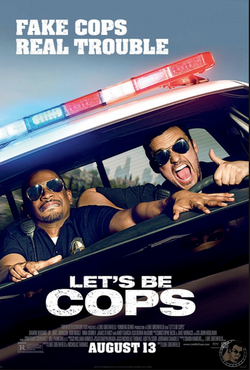
COMEDY!
Here is an example of a comedy movie poster! Although this is a professional movie poster and has all the good elements that a poster should have. We wouldn't have a movie poster like this, this is because we would want elements that make our movie poster look like a horror because in our A2 course we are going to be making a horror trailer and a poster to match what our movie is about. We could use some of the elements like having the bold text and dark colours to create an atmosphere and tension. However we wouldn't have our actors smiling and looking like they are having a good time, we would want our actors to look scared and vulnerable towards what is in front of them. Another thing we would have on our horror poster that they don't have on this movie poster is a change in lighting on the main photo, as a group we would chose to do this to create an atmosphere and a sense of tension. |
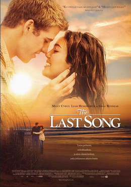
ROMANTIC!
Above is an example of a romantic movie poster! Even this looks professional for the genre of its movie, it would not be suitable for a horror movie poster this is because the colours contradict of stereotypical horror poster this is because you would find dark and mysterious colours rather than light and calming colours. Another reason this poster would not be suitable for a horror poster is because the actors are too close together and they both have a happy emotion on there face, this isn't suitable for a horror movie poster because we wouldn't want our characters to look like they have a close connection, this is because they are meant to enemies. We also wouldn't want them to have a happy look on there faces this is because they are meant to create a sense of evil and mystery, this is because they have been picked to act in a horror movie rather than a romance or comedy. |
