In What Way Does Your Media Product Use, Develop Or Challenge Norms And Conventions Of Real Media Products?
|
Using conventions
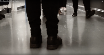
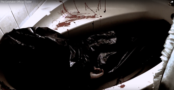
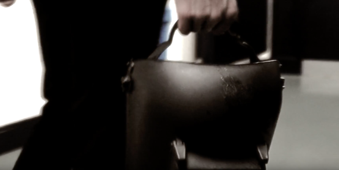
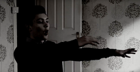
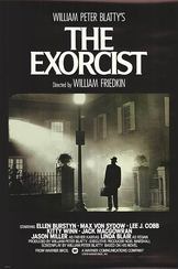
The first convention we used in our trailer was the feet in the corridor shot. We put this in first as we thought it would build suspense and leave the audience asking who the person is. To add to this suspense, we had everyone move out of the way of the mystery person so it shows the the audience that this person is feared by the students and is avoided at all times. The second convention would be the filming in a filthy, dark bathroom. We showed the dead body and the killing in this bathroom as it matches to Carol Clovers theory of 'bad things happen in bad places'. This is your conventional horror movie as bad things happen in them or it wouldn't be scary. We took the bathroom scene from on of the scenes from 'IT'. this is where the young girl is trying to get away from her father and the room fills with blood. This shows that there is nowhere to run and they are trapped in a place of horror. We also put the dead body in the bathtub because it contradicts the hole function of a bath. Its main function is to clean someone and keep them looking fresh, however in this case its the bed for a dirty dead body. Developing conventions Our main prop we used was the mask to hide the killers identity. We had the killer wear the mask when he is killing the students, yet had him holding it when he is just walking around the school. This is to show that he has two identities. We used different props like a mallet to show that the killer used it for everyday handy jobs and for killing his victims. Masks and weapons like hammers are usually used in horror films. For example, Friday the 13th, Jigsaw and The Purge are good examples of killers that wore masks and killed people with everyday items. At the start of the trailer we had a school bell ringing followed by dark lighting. This was to show that even in a place of education and safety, there is still uncertainty and danger. This also contradicts how the audience typically views the school as a safe place where nothing horrific happens so this makes the trailer more horrific to the audience as they do not expect torture and murder to happen in a school. Challenging conventions We didn't necessarily challenge conventions as we had a male killer and a female victim. However we challenged conventions by having a very male orientated cast list. The reason we had this was because we wanted to stick to the stereotype that people are usually attracted to. This will mean that we will therefore have more of a audience then others. We had a male teacher, victim and killer for two reasons. The first one being that having a male teacher and a male killer shows dominance to the horror, and the second thing being that we conformed the stereotype by having a male victim as it shows a weakness to the male gender. POSTER |
|
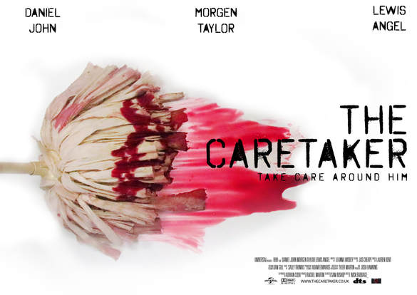
When we created our poster we decided to have a white background as it showed the purity of the victims and illustrated how pure a school is supposed to be. We used black font as it contrasts with the background and it also shows that there is something dark and sinister hidden in the film. Our poster itself we related to a previous A Level poster 'SCISSORS' which also consisted of a white background and black font. We used a mop as the main image on the font cover as it is something you mainly associate a caretaker with and the use of the red blood smearing across the floor shows that there is going to be a murder and that he is trying to clean up the evidence.
|
|
|
Poster for movies used the convention of putting names of actors on their poster at the top, which we decided to follow. This is so people now who is in the film and the name of the main actor. At the bottom of our poster we put the credits to show who was a part of making the trailer and what roles they played. We decided to put the title 'The Caretaker' to the side of the image because it seemed as though the mop was spreading the caretaker around the school. We also put it on the centre right hand side because it made the title and font more clear, and it was obvious that the name of the trailer was 'The Caretaker which is a very important part to the trailer. The tagline underneath the title in the same font and colour was because it stood out just as well. Most horror posters only have a few words for their tag lines which is why we have only chose to have 4. The other things we used on the bottom of our poster is dolby digital and dts. These are an advanced sound audio technology that allows Dolby audio experience in home theatres, smartphones, operating systems and browser. We have put these on as all posters has them and we want it to look professional.
We decided that we want to take a seperate photo the have one from the trailer because we felt like if we used a still picture from the trailer then it would spoil the illusion of the trailer. Therefore having a seperate photo meant that it would make the audience feel compelled into wanting to see the film. Our image links to the horror convention of using blood on the front cover ad it shows weakness and that something bad is going to happen. We followed this because it clearly shows the audience that something bad is going to happen because someone is trying t cover something up by cleaning up blood off of the floor.
We decided that we want to take a seperate photo the have one from the trailer because we felt like if we used a still picture from the trailer then it would spoil the illusion of the trailer. Therefore having a seperate photo meant that it would make the audience feel compelled into wanting to see the film. Our image links to the horror convention of using blood on the front cover ad it shows weakness and that something bad is going to happen. We followed this because it clearly shows the audience that something bad is going to happen because someone is trying t cover something up by cleaning up blood off of the floor.
MAGAZINE
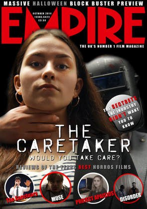
We decided to use a brunette girl on the front cover of our magazine as it goes against conventions of only having blonde women to attract the audience in. It is quite clear that the women is in a dangerous situation so it also goes against conventions that the victim is always a blonde female. so therefore we chose a dark haired girl because it isn't like any other horror. We had a male in the background with the mask on to show the killer and that it matches conventions that say the killer is always male because they are the more dominant sex. A lot of magazine covers have male and females that star in the film on the front cover. We decided to do the same as it seems to attract audiences in and it shows the main characters that are in the film. Also intising the audience in to watch the film. We did this because we wanted to follow Clovers theory of that the female character is usually the weakest character, which in this case is true for our trailer. We made the decision to have her facing the audience show she is facing the target audience and making eye contact with them. Using a female on the front cover with a hand around her neck allows people to think that this horror conforms to the normal horror stereotype of the woman being the victim. We chose not to use a still image from the trailer because we wanted to show a brief way of how the killer may react without giving too much away. Another reason for why we didn't use an image from the trailer was because if we did use a image from the trailer it would have no story to it would so they audience wouldn't understand what was going on. By using an image we took of just the female it links that the trailer is perhaps about a young girl. We wanted our magazine to be more of the glamorous type to make people pay attention and want to buy the magazine. This is also following convention because professional magazines will take high quality photos so people are more attracted and persuaded to buy the magazine.
We mainly had dark colours because it reminds people of horrors and links to the stereotype. We also linked it to the similar tone of the trailer to the colour tone of the magazine colour as most other professional ones tend to use colour. We used red for some of the important words because they stand out over the ones that aren't as important. We put the name of the movie in white colour and the same font as in our trailer. The reason for the reason for this is because it stands out over the dark background which will draw the audience in to read the magazine. We used a convention because most magazine covers use white font a lot of the time. We stuck to the normal convention that the background will be a solid black colour.
We put the title of the magazine at the top of the page as this follows conventional magazine covers as they all have the main title at the top. This way customers are able to see what make it is and find it easily. We put the title of the film at the bottom middle of the page under Morgen's face as we felt that it was the best place to put it and it really stuck out well against the black.
