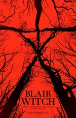
This is the title to the Blair Witch Project. This title stands out really well because, it is black writing over a bright read background. The Blair Witch symbol is enhanced behind the writing almost to intimidate the audience. The title is very simplistic which is successful as it doesn't over complicate the title to end the trailer. The tagline to this is "There's something evil hiding in the woods". This tagline works well as it is relevant to film.
|
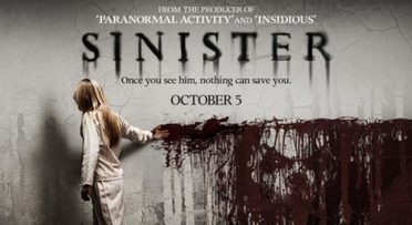
The font style of this film is been created to look like its running down the wall because there is blood underneath it that is being dragged across the wall and it also going to run. This links the film and title together because they both have the same theme going on. It also has sharp edges on the font to indicate that the film is gong to be hardcore horror film and that there is nothing soft about the film. Also the colour of the title which is black indicates that this isn't going to be a nice film because the colour black has negative connotations.
|
|
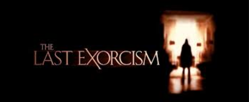
The font used for this title is again, another different one. the title colours is different again, its white inside with a red glow. The font is again very sharp and puts emphasis on the X to indicate a religious cross turned sideways to indicate that the devil is there, which links the film about people being possessed by the devil, which is what causes an exorcism.
|
OUR TITLE
|
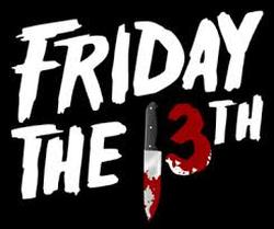
Friday the 13th is known as a day of bad luck. With the film being called this it indicates to the audience that the film isn't going to be one of the nicest and bad things will happen. As there is a picture of a knife and blood one the 3 suggests that somebody is going to get stabbed and the film isn't going to end well.
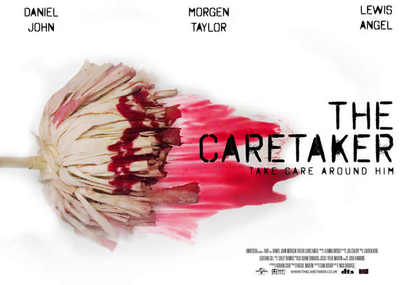
OUR TAGLINEWe chose the tagline "Take care around him" because it contradicts his role as someone who takes care of the school and also shows the dangers you may face if you are not careful around him. It links perfectly to our trailer and adds a sinister effect onto it.
|