|
|
As a group we set an iconic image for our trailer, poster and magazine. We needed a brand that would stand out and make people know it was our trailer. it needs to be professional, and iconic for it to work. making an iconic image for our film is a big project because this is all part of branding and by branding on a film it makes people want to buy products and its a part of advertisement with having lots of sales and high ratings.
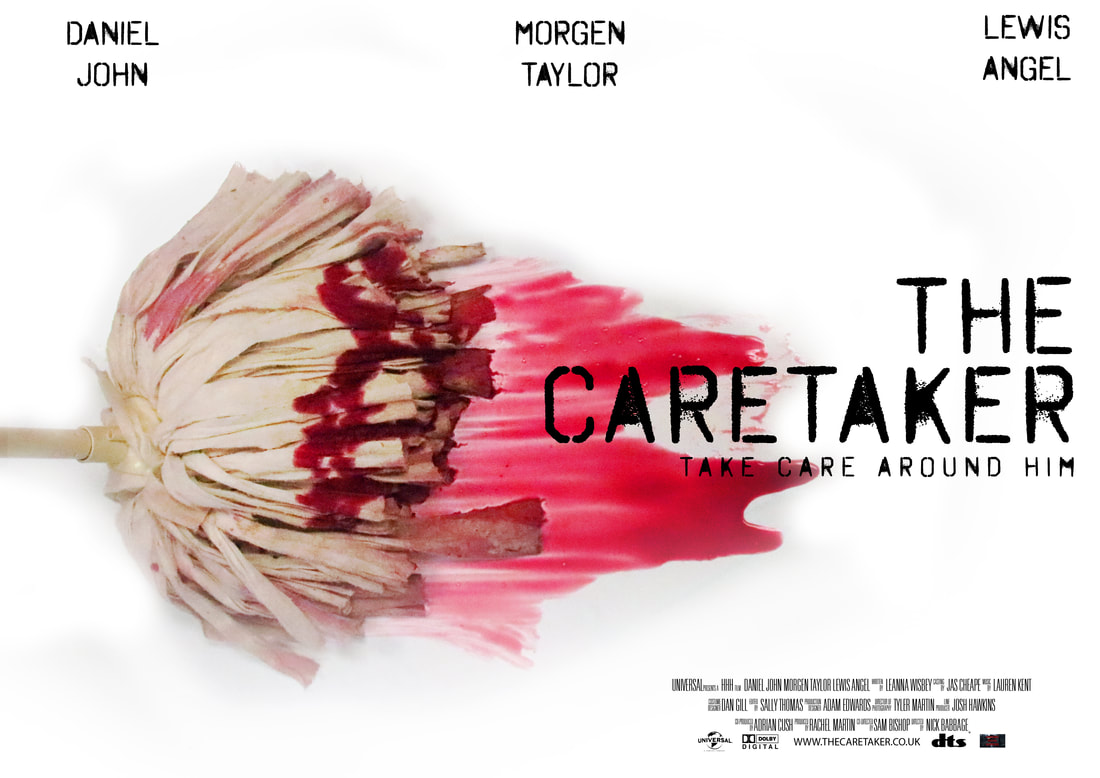
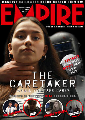
We first of all started with making the trailer and when it had been finished with we then went on to thinking of an iconic image for branding. With having the iconic eye-catching image on out magazine poster and trailer we needed to brain storm off the trailer and then as a group we came up with the idea of having the abandoned building featuring on everything because it's the first thing we see in the trailer and also the first thing we talk about. The reason why we chose to have the mop and blood was to show the Care Taker's purpose in the school. A mop is a main piece of equipment that they use in their day to day job. The reason why we chose to have a girl and the killer on the front cover of the magazine is because we feel like having a female on the front cover will attract more of a male orientated audience and to have a female
We first of all started with making the trailer and when it had been finished with we then went on to thinking of an iconic image for branding. With having the iconic eye-catching image on out magazine poster and trailer we needed to brain storm off the trailer and then as a group we came up with the idea of having the abandoned building featuring on everything because it's the first thing we see in the trailer and also the first thing we talk about. The reason why we chose to have the mop and blood was to show the Care Taker's purpose in the school. A mop is a main piece of equipment that they use in their day to day job. The reason why we chose to have a girl and the killer on the front cover of the magazine is because we feel like having a female on the front cover will attract more of a male orientated audience and to have a female
ICONIC TEXTS
Harry Potter:
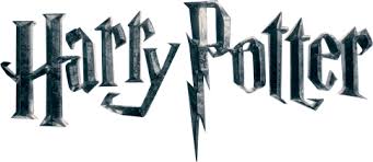
The film Harry Potter was an incredibly popular film in 2001, as well as the font, we would be able to recognise it straight away. The font of the film title represents the whole film itself, this is because of the of the style of the letter 'P' in the title. This represents Harry's scar on his forehead. The 3D build to the text and the fact that it hovers in the sky also adds to the illusion of the film.
The film Harry Potter was an incredibly popular film in 2001, as well as the font, we would be able to recognise it straight away. The font of the film title represents the whole film itself, this is because of the of the style of the letter 'P' in the title. This represents Harry's scar on his forehead. The 3D build to the text and the fact that it hovers in the sky also adds to the illusion of the film.
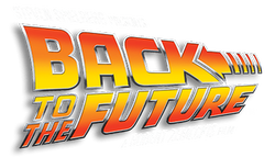
Back to The Future:
The film Back to The Future was a very popular film in 1985, as was the film title text. This was an iconic text because if you use this font for something different, we would instantly recognise the font and know that it is from back to the future. THe font itself is very futuristic, bold and vibrant. This helps make the film title recognisable and fits in well with the theme of the film.
The film Back to The Future was a very popular film in 1985, as was the film title text. This was an iconic text because if you use this font for something different, we would instantly recognise the font and know that it is from back to the future. THe font itself is very futuristic, bold and vibrant. This helps make the film title recognisable and fits in well with the theme of the film.
ICONIC IMAGES
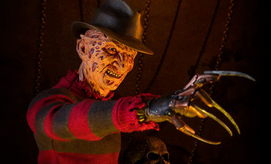
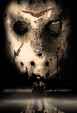
An iconic image to do with horror would be characters like Jason and Freddy Krueger. The reason for this is because they are well known and are resembled the most with horror/slasher films. They are also iconic images by what they wear and what weapons they have. For example, Freddy has the glove with talons, a black and red shirt on and a black hat; Jason on the other hand has a hockey mask on, an axe and a long black trench coat. This makes these characters rememberable and recogniseable.
|
|
ICONIC POSTERS
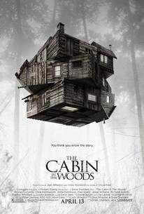
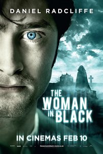
Iconic posters are made by having a memorable image on the front along with a memorable title and tagline. The things that make these posters so memorable are these: The effects that are put on the image e.g. tones, effects,colours, A well-known actor, character from the film and an iconic location. Good examples would be 'The Woman In Black' and 'Cabin In The Woods'. The reason for the woman in black being so iconic is because it consists on the ghost itself, the main character, a title that stands out and the location in the background. The dark foggy effect stands out because it set the tone of the film and gives a scary illusion to the film just by the poster. The cabin in the woods stands out to the audience as the cabin is floating in the air with the title below. This leave the audience to ask a range of questions, why is the house floating? Why is the title underneath? Is that what's ,making the cabin float? Compelling the audience to watch the film.
|
|
ICONIC MAGAZINES
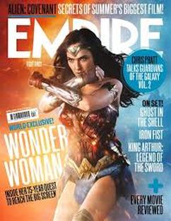
Empire is one of the most iconic magazines of film. This magazine mainly shows the news about recent films, the reviews of films and sneak peek previews of upcoming films. With this magazine they are sticking with one film to focus on which is 'Wonder Woman', this film was released on the 15th of May in 2017. With the main image, they have kept it simple with only showing the main character of the film. This shows that they are going to be talking about the film 'Wonder Woman' throughout the magazine.