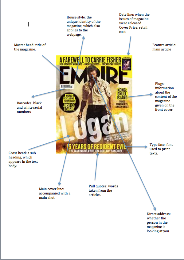
On this page we have identified 4 different film magazine covers. We have done this to gain ideas of what magazine covers looks like and how we can make ours look professional.
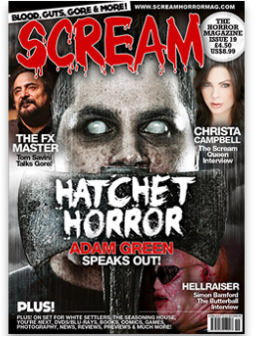
By the front cover of this magazine, we can clearly see that the genre of film that it is advertising is a horror. We are able to see the specific techniques and features used in this in order for it to look professional. This also helps appeals to the target audience because the magazine makes it clear that it's about the horror genre, this is shown through the images and title. The title makes the genre clear because it says 'scream' this shows that its a horror magazine because you only scream when you're scared and it also lik to the film phenomenon scream. The main image on this magazine cover is called a staged scene from the film.
Also the use of secondary images show different actors that people may idolise because of the part that they play in their favourite films. This is also effective because the poster gives a specific image which s professionalism because there are other celebrities used, however, some of the celebrities used may not be super famous like other for example like Leonardo DiCaprio, who is identified as soon as you see him, whereas, other actors like Christa Campbell who is a famous actress but some audiences may not know who she is. The tagline says 'blood, guts, gore and more!' this tangline shows what the content of the magazine actually is, it shows the genre of the magazine and how it can attract to its target audience. The cover line says 'hell-raiser' this attracts audiences to read the magazine because it indicates that there is something that's worth their time and patience in the magazine. The puff used in this magazine is the main focus on the main photographs face, this has been used against a dull background to emphasis the darkness of the theme of the magazine and to make sure that the main image of the magazine stands out and this is what attracts its target audience. However, the uf isn't used very well on either of the magazines because there are no freebies advertised therefore, there's ot hook on the magazine for people who wouldn't really pick this type of magazine up. This magazine uses the barcode and price addition well because again its on the corner where the magazine will get opened and therefore, will be seen straight away because of the customers flicking through before buying. The font used for this magazine helps create a sense of horror because the ed title and font looks like there is blood pouring down the page therefore, giving a sense of danger and murder, it also a very soft font where the edges are curved and this shows that this is a more fun and less serious magazine. |
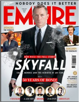
In this example of a magazine cover, for a Action film, We are able to see the these, techniques and features used in order for it to appeal to its target audience and look professional. Ths helps to create a Action themed feel to the magazine because of the gunshot on the front cover, this clearly tells the audience what film it is about, this is also made clear because of the main character in costume on the screen and the use of anchorage 007 logo on the top left corner, appeals to its target audience because James Bond is a massive hit in the Uk and all over the world, therefore, when people see their favourite film they automatically think that they have to see it.
The secondary image is of two very famous celebrities like Scarlett Johansson and Will Farrell. They have used these celebrities in order to attract different audience members, this helps broaden the audiences for this entertain magazine and therefore make more profit. The tagline also says 'nobody does it better' this tangline has two different interpretations to it. The first interpretation being that it's about the magazine being amazing and that nobody else can do it better than Empire can. The other interpretation can be that nobody can do it better than James Bond and this is the best magazine to buy because there's not a better magazine or feature you can get. The coverline on this magazine says 'our greatest awards ever' this has been used to advertise what's to come inside the magazine and this attracts certain audiences that appeal to keeping up worth celebrities gossip. The puff used in this magazine is the title and the main image, this has been made obvious because of the background colour used which in this case is white this is used in order for the title to stand out because it bright ed and on a white background it stands out even more and the images stand out because of the darker images on a lighter background. However, the uf isn't used very well on either of the magazines because there are no freebies advertised therefore, there's ot hook on the magazine for people who wouldn't really pick this type of magazine up. This magazine also uses the correct way to advertise the barcode and price addition, they have placed this on the side of the cover age where you open the magazine so it's easy for the customers to pick it up and see the price straight away. The title on this magazine is bright red and stands out in front of the page, also the font is very harsh this shows that it more professional and title will always be the same no matter what theme the magazine is. |
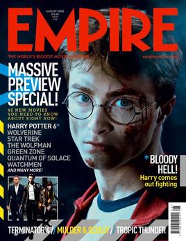
In this example of a magazine cover, we are able to see what a typical main character magazine cover looks like. We are able to see all the specific features and techniques used in order for it to look professional. This also helps appeals to the target audience because the magazine makes it clear that it's about the film, this is shown through the images and title. The main image on this magazine cover is called a image of main character.
Also the use of secondary images show different actors that people may idolise because of the part that they play in their favourite films and it also names lots of different massive films that people may love. This is also effective because the poster gives a specific image which shows professionalism because there are other celebrities used. The tagline says 'massive preview special' this tagline shows what the content of the magazine actually is, it shows the specific feature of the magazine and how it can attract to its target audience. The cover line says 'bloody hell' this attracts audiences to read the magazine because it indicates that there is something that is shocking and eye catching in in the magazine. The puff used in this magazine is the main focus on the main photographs face, this has been used against a dull background to emphasis the the main character on the cover, this also helps to reveal the film and the mood of the magazine. However, the dark background isn't used very well on the magazine it makes the magazine look dull and boring. Also, audience members wouldn't want to pick it up because there are no freebies advertised therefore, there's no hook on the magazine for people who wouldn't really pick this type of magazine up. This magazine uses the barcode and price addition well because again its on the corner where the magazine will get opened and therefore, will be seen straight away because of the customers flicking through before buying. The fonts and colours used for this magazine helps create a sense of darkness because the title and font and dull and help to create the mood of the magazine, giving a sense of danger and murder, it also a very harsh and sharp font where the edges are straight and pointed and this shows that this is a more professional and serious magazine. |
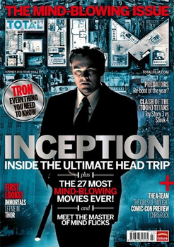
In this example of a magazine cover, for a Action film, We are able to see the, techniques and features used in order for it to appeal to its target audience and look professional. Ths helps to create a Action themed feel to the magazine because of the gunshot on the front cover. thi is shown through the image being an actual image from a scene of a movie, this clearly tells the audience what film it is about, this is also made clear because of the main character in costume on the screen and the use of anchorage of inception title on the middle of the page, appeals to its target audience because Leonardo DiCaprio is a massive star globally, therefore, when people see their favourite actor on the cover they automatically think that they have to see it because their idol is on the page.
The secondary image is the background of the film scene and there are images on the title is a birdseye shot of buildings. They have used these images in order to attract different audience members, this helps broaden the audiences for this entertain magazine and therefore make more profit and elkp to create a sense of location The tagline also says 'the mind-blowing issue' this tagline means that the magazine is amazing and that nobody else can do it better than film can. it can also mean that the depth of the film and the ideas in the film are so amazing that you wouldn't be able to find a better film. The coverline on this magazine says 'first looks' this has been used to advertise what's to come inside the magazine and this attracts certain audiences that appeal to keeping up with what's the best thing to know and it helps to make the audience feel like they're VIP because they want their magazine to sell. The puff used in this magazine is the title and the main image, the main image use is an actual photograph from the film, this has been used to create a sense of realism in the magazine. The title used is 'Film' but is used with a bird's eye view shot over building, this is used t show that this magazine can see everything and never misses out on the gossip. However, the puff isn't used very well on either of the magazines because there are no freebies advertised therefore, there's ot hook on the magazine for people who wouldn't really pick this type of magazine up. This magazine also uses the correct way to advertise the barcode and price addition, they have placed this on the side of the cover where you open the magazine so it's easy for the customers to pick it up and see the price straight away. |